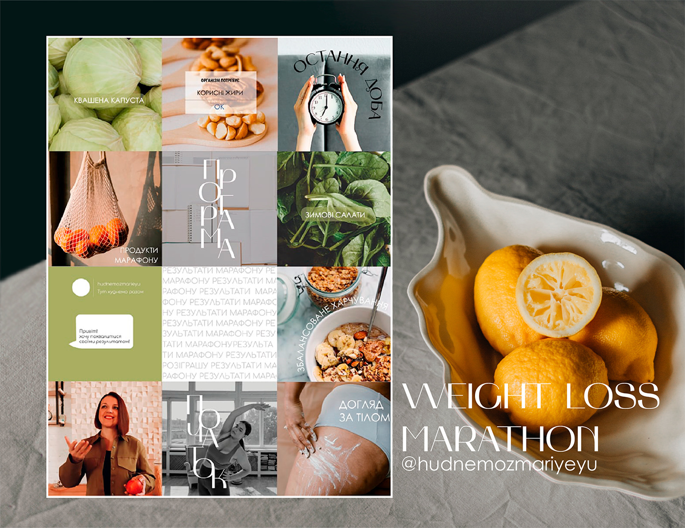
1. DESIGNING A 12-POST GRID FOR THE @HUDNEMOZMARIYEYU’S HEALTHY WEIGHT LOSS MARATHON INVOLVED A UNIQUE APPROACH.
The primary objective was to establish an eco-friendly aesthetic with natural color tones, while making nutritious food appear delectable and promoting the concept of body positivity. To achieve this, we deviated from the stereotypical “Instagram-perfect” model photographs, opting instead for images that better represented real bodies. The inclusion of graphic elements added a touch of modernity, while also making the page feel less dense. Creative use of typography was another strategy employed in this design.
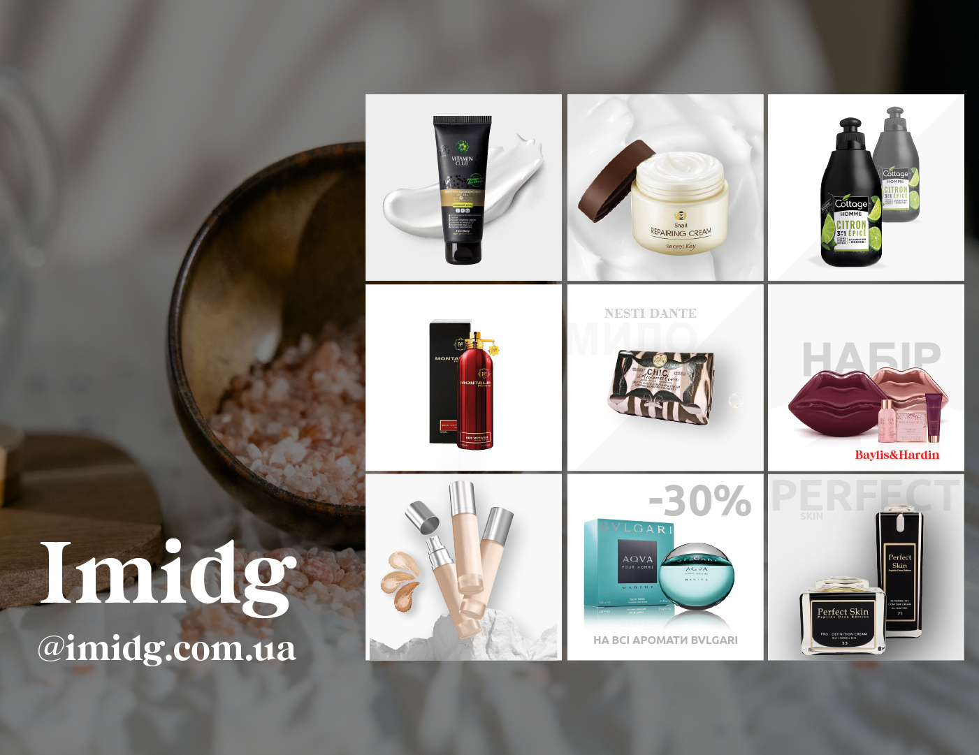
2. CREATING A 9-POST GRID FOR THE COSMETIC AND PERFUME RETAIL CHAIN @IMIDG.COM.UA WAS APPROACHED WITH SPECIFIC GOALS IN MIND.
The primary mission was to showcase and sell products effectively while maintaining a high level of presentation quality. The design approach was minimalist, integrating typography with authentic photos. Given the commercial nature of the page, it was kept free from extraneous graphic elements, keeping the focus purely on the products.
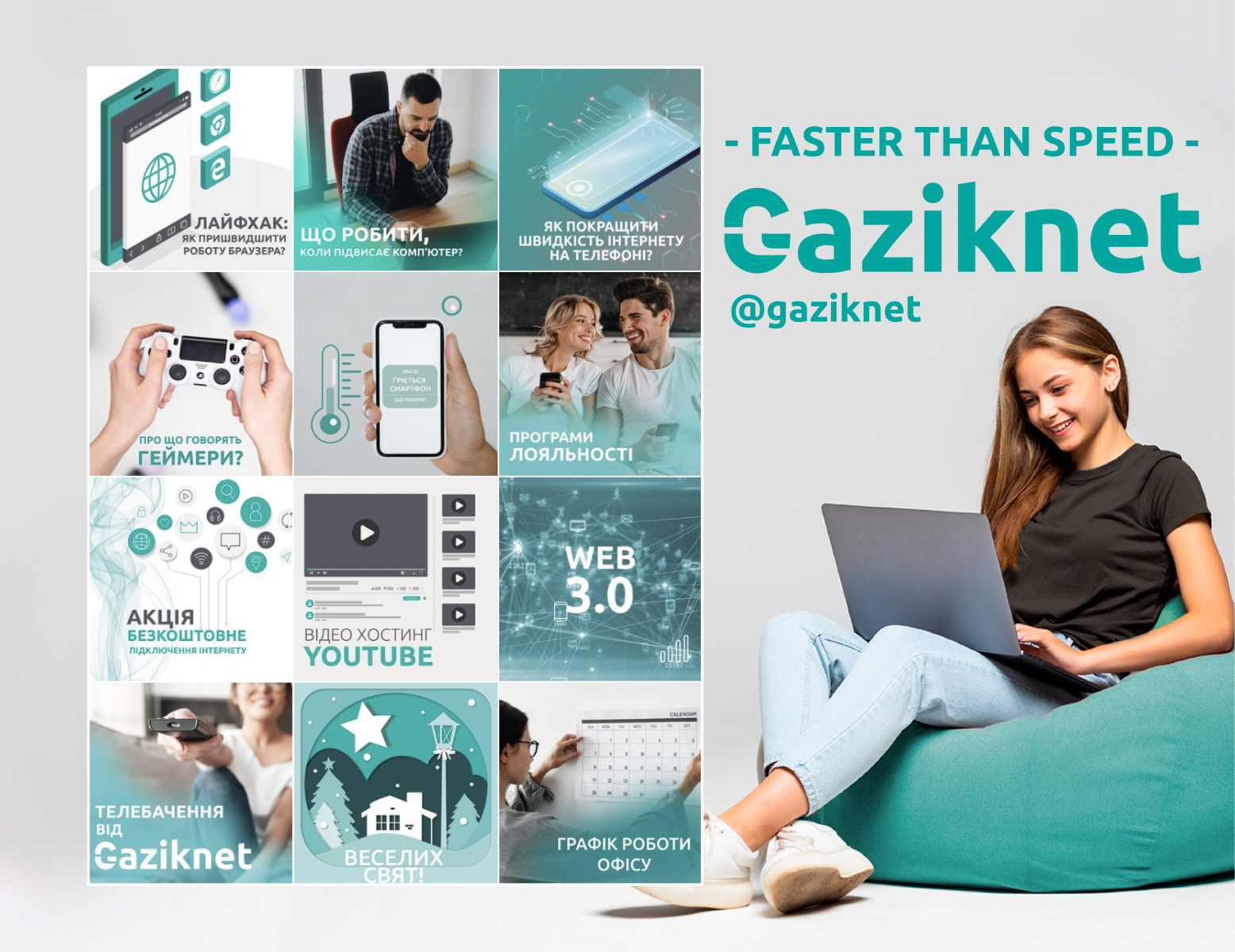
3. CRAFTING A 12-POST GRID FOR THE INTERNET PROVIDER @GAZIKNET INVOLVED FOCUSING PRIMARILY ON INFORMATIVE CONTENT.
This included addressing popular user queries, offering insights about technology and the internet. The visuals were made distinct and diverse to capture reader interest, alternating between vector illustrations, authentic photographs, and abstract imagery. To maintain visual coherence, we incorporated branded colors and fonts along with a structured grid layout.
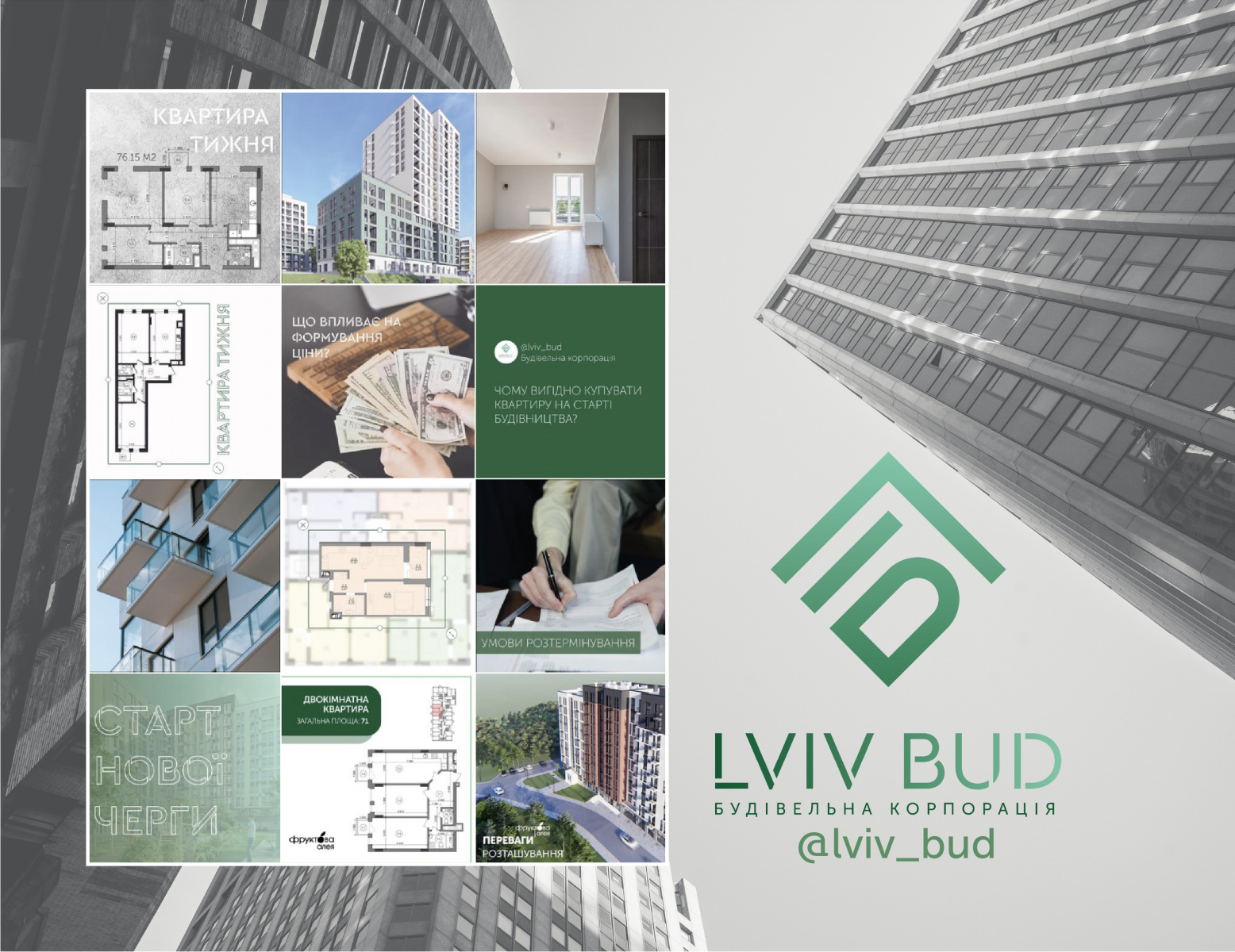
4. CONSTRUCTING A 12-POST GRID FOR THE CONSTRUCTION CORPORATION @LVIV_BUD, THE PAGE SERVED BOTH INFORMATIONAL AND COMMERCIAL PURPOSES.
Informative posts were interspersed with promotional content. Transparency was key in building customer trust, hence professional drawings of open floor plans were frequently displayed, and topics relevant to potential buyers were highlighted. The visual color palette adhered to the project’s style, infused with texture elements and construction photos.
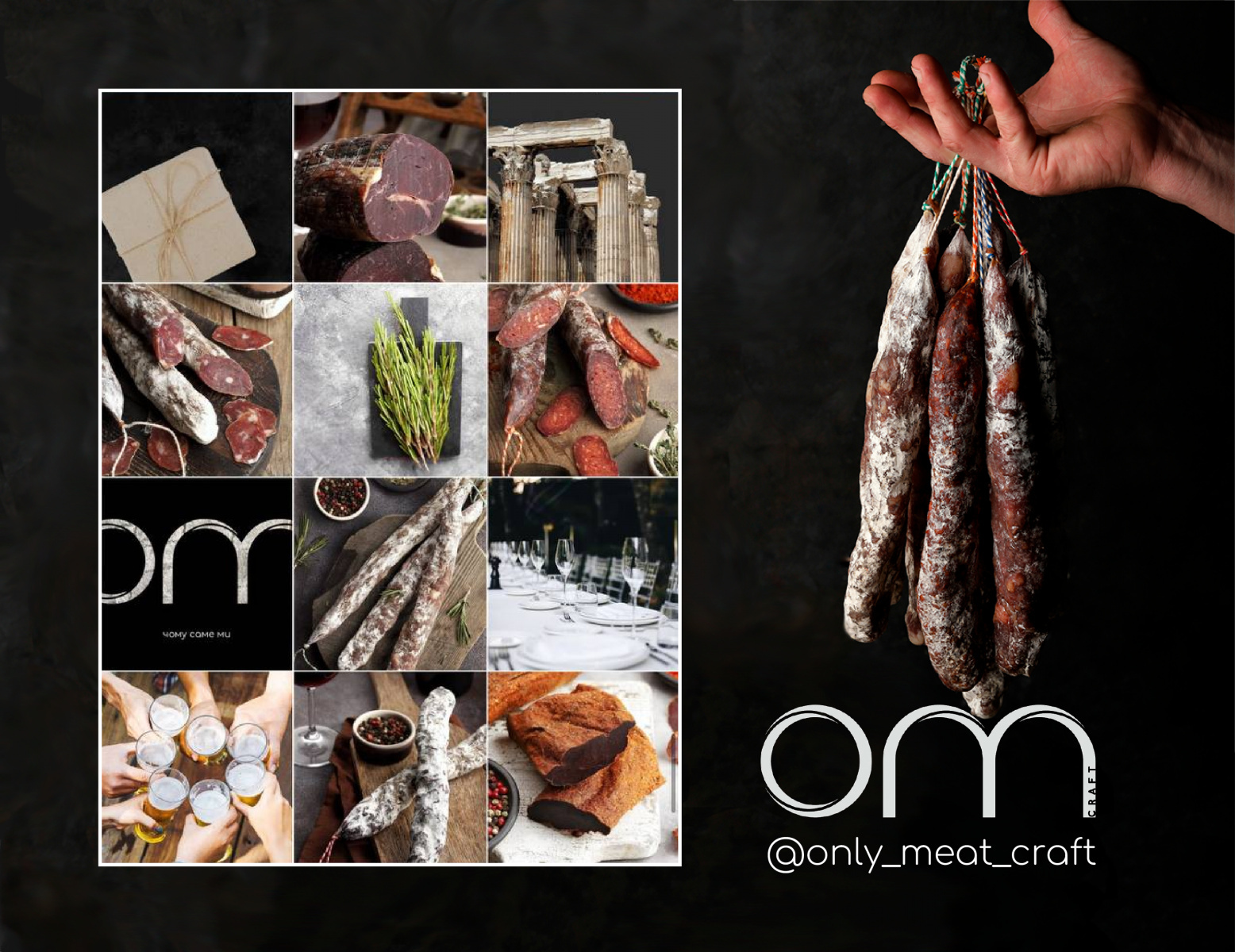
5. THE @ONLY_MEAT_CRAFT PAGE VISUALIZATION FEATURING 12 POSTS WAS COMMERCIALLY DRIVEN.
The main objective was to make the products look appealing, highlight the unique aspects of jerky consumption, and stimulate the desire to try craft sausages. The posts varied between product photos, recommended accompanying beverages and spices. The high-end nature, sophistication, and exclusivity of the brand were portrayed through the amalgamation of black, wood, stone, and meat textures.
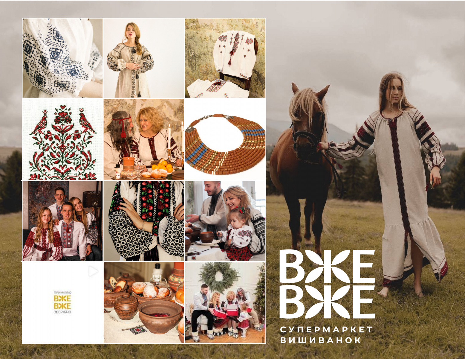
6. FOR THE EMBROIDERY SUPERMARKET @VZHE.VZHE, A 12-POST GRID WAS CREATED SERVING BOTH COMMERCIAL AND INFORMATIONAL NEEDS.
The key task was to present embroidered shirts in an aesthetically pleasing way. This was achieved by using appealing natural colors (with color correction), authentic Ukrainian photography, and attention to textures and details.
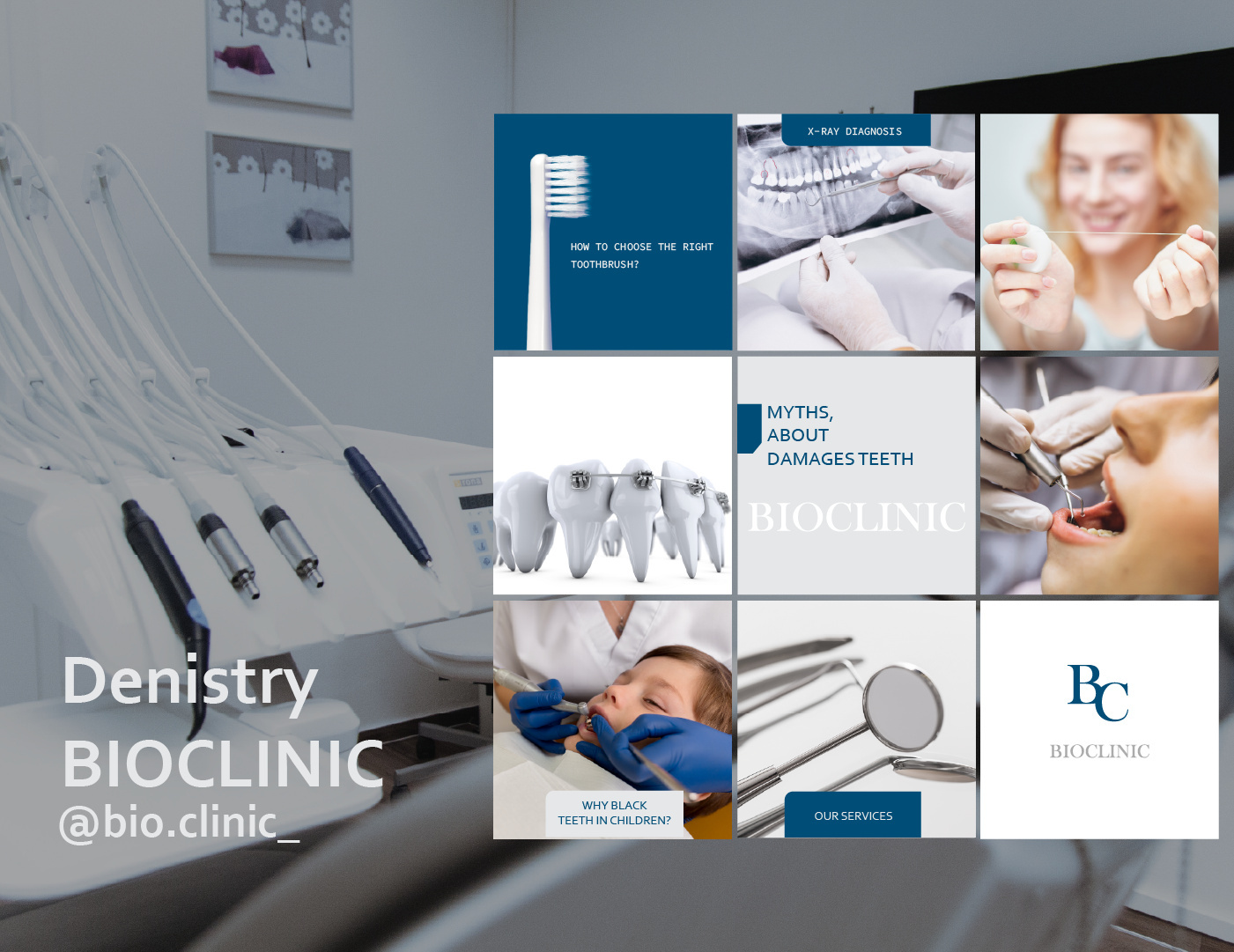
7. DEVELOPING A 9-POST GRID FOR THE DENTAL CENTER @BIO.CLINIC_ WAS FOCUSED ON PROVIDING INFORMATIONAL CONTENT.
The aim was to explain dental and oral care features to clients, while also introducing the clinic’s services. Building trust with clients was a primary concern. To achieve this, we combined aesthetically pleasing photos with branded colors and graphic elements that helped dispel the common fear associated with dentists. Detailed images of high-quality equipment and the work process were also displayed, instilling a sense of calm in potential clients prior to their visit.
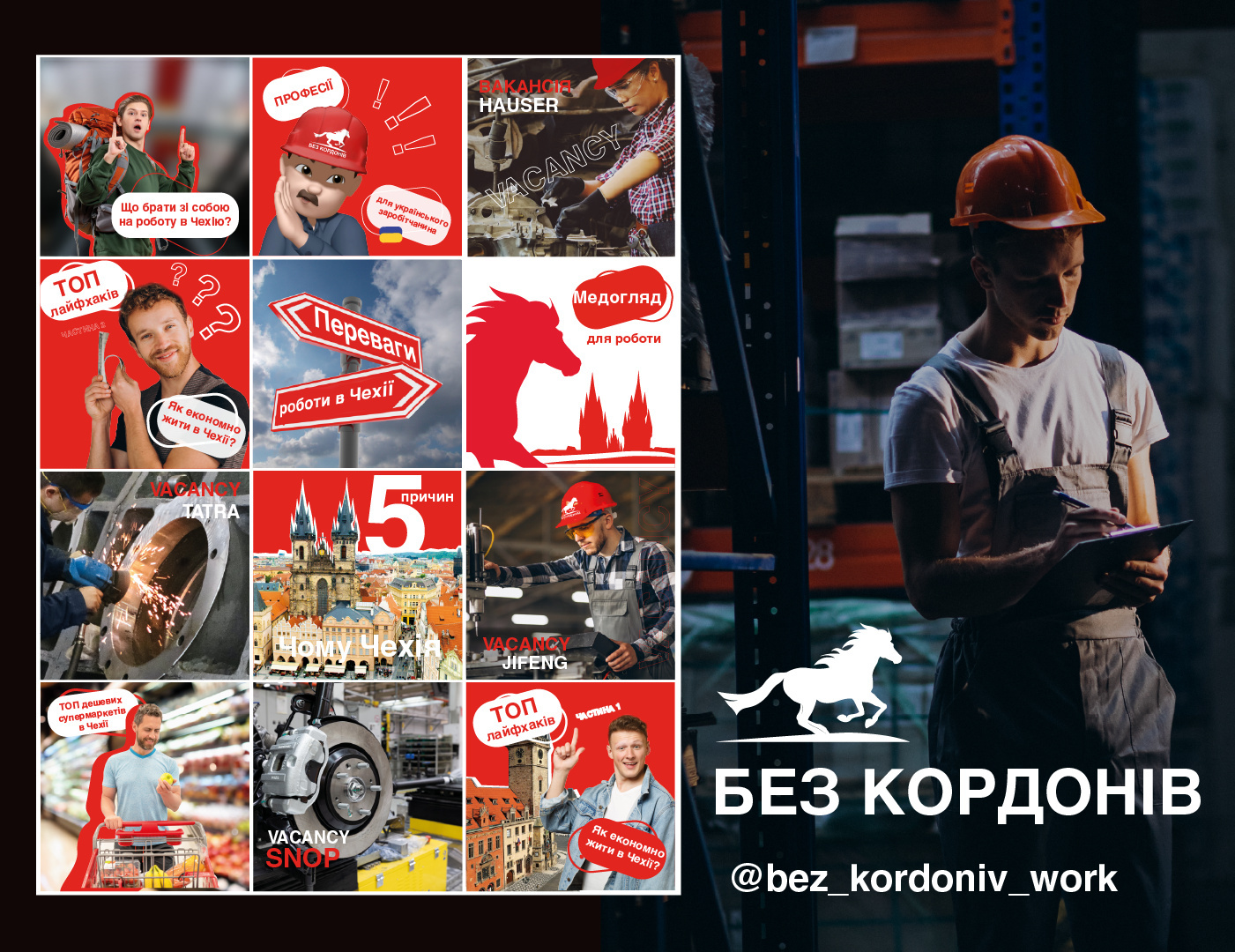
8. CRAFTING A 12-POST GRID FOR THE RECRUITMENT FIRM BEZ KORDONIV INVOLVED A PRIMARY OBJECTIVE OF INSPIRING POTENTIAL CLIENTS TO CONSIDER NEW JOB OPPORTUNITIES IN THE CZECH REPUBLIC, WHILE ALSO BUILDING TRUST.
This was achieved through the use of vibrant, dynamic colors and compositional strategies designed to motivate bold decisions. The page served an informational purpose, detailing the specifics of working in the Czech Republic and the intricacies of job hunting abroad, thus fostering client trust and assurance in the company’s expertise and abilities.
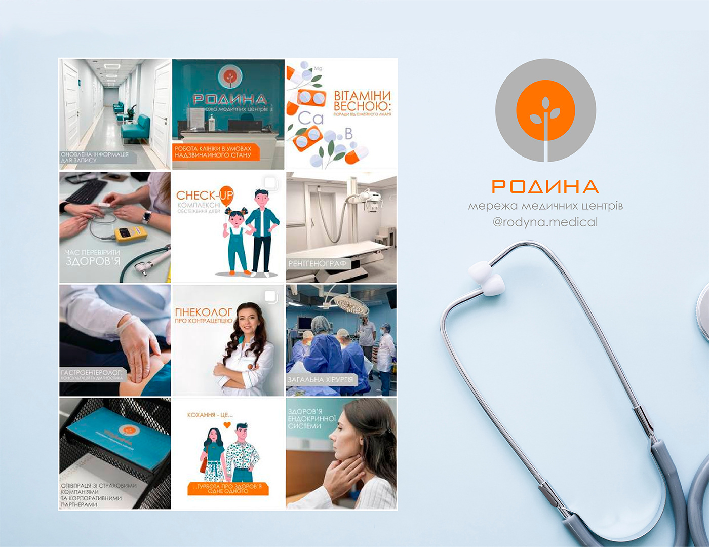
9. THE DEVELOPMENT OF A 12-POST GRID FOR THE “RODYNA” NETWORK OF MEDICAL CENTERS PRIMARILY SERVED AS AN INFORMATIONAL PLATFORM.
Posts were dedicated to medical topics, elucidating various disease features or pathologies, providing advice from assorted medical professionals on a range of topics, debunking medical myths, and promoting the services offered by the clinic. The visuals adopted a minimalist and clean approach, alternating between authentic photographs and various illustrations to instill a sense of comfort towards the clinic and to alleviate fears of intimidating medical professionals.