- Developed a logo for Kolibri beauty salon, capturing the concept of merging a bird’s silhouette and a pair of scissors. The colors were picked as per client’s preference, with a font that aligns with the logo’s form.

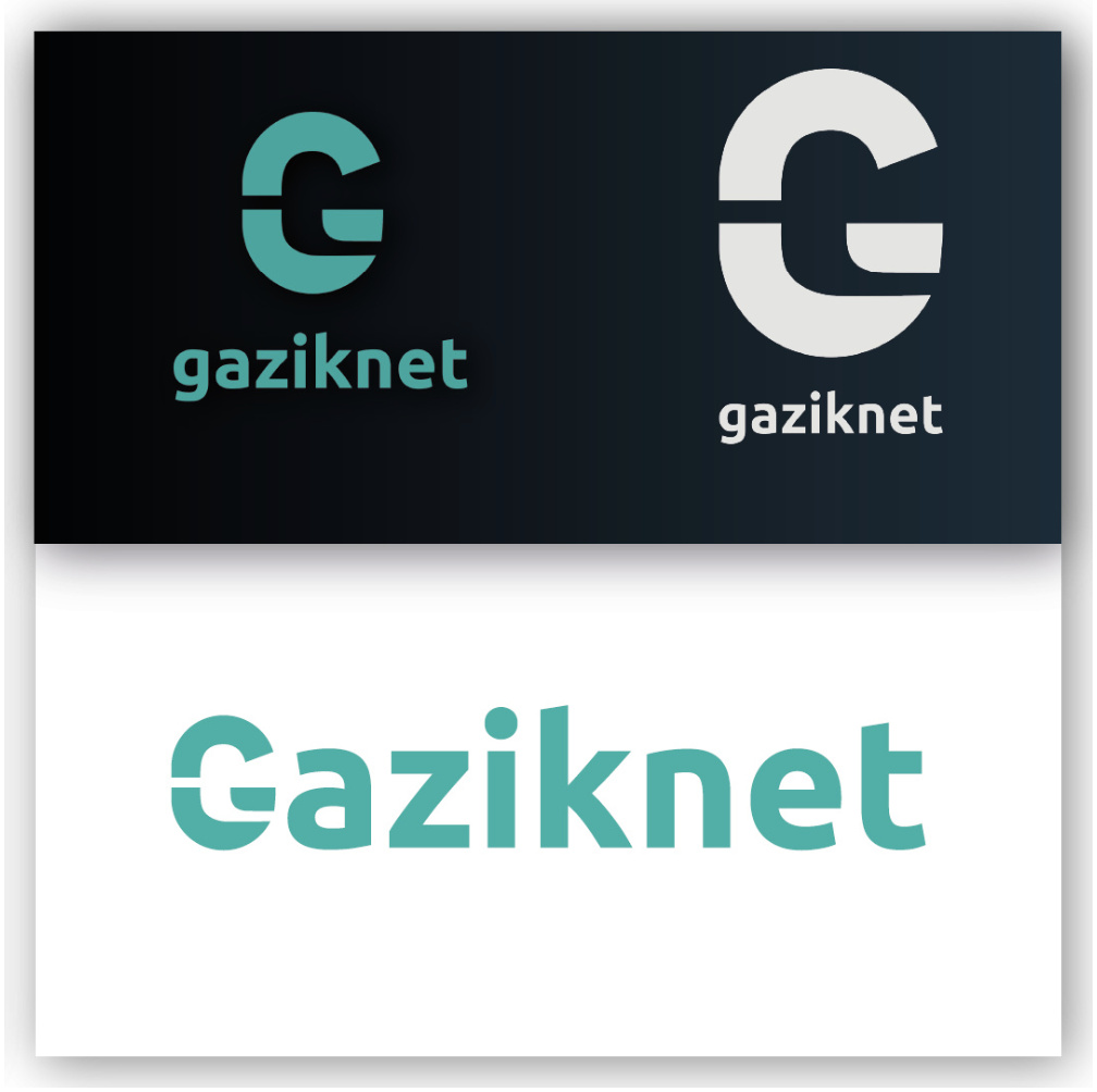
2. Crafted a logo for the Internet service provider Gaziknet. The goal was to design a logo in an expansive and rounded version that could be utilized on petite branded items. The color choice drew upon consumer associations – cool shades of green and gray linked with the Meta universe. The letter ‘G’ was deftly interpreted into the pattern.
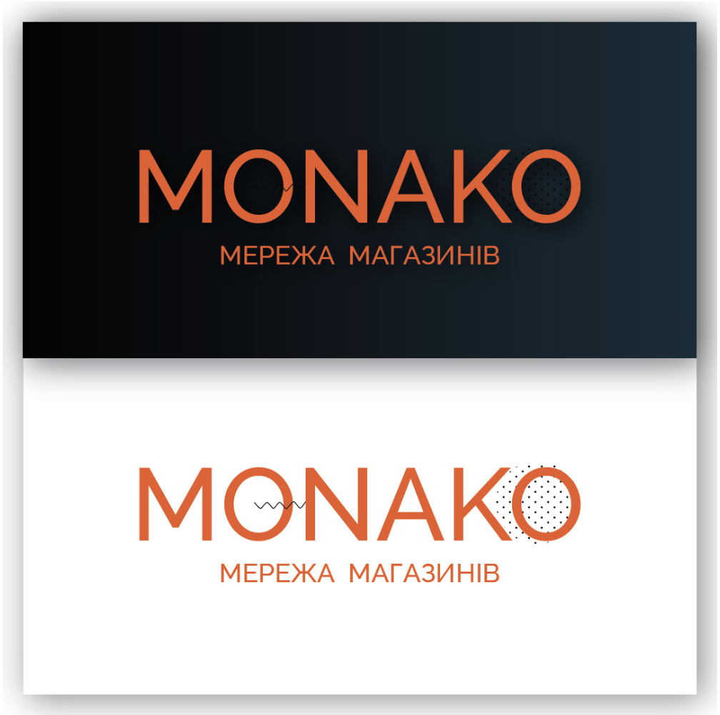
3. For the Monako chain of children’s stores, we created a logo with bright orange as the primary color to grab children’s attention. The logo design is minimalist, with additional elements rendering a playful and lighthearted kid-friendly ambiance.
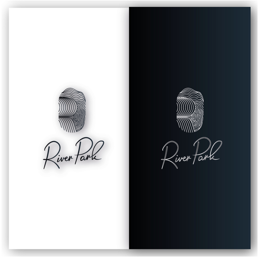
4. For the “River Park” hotel and restaurant complex, it was essential to underscore the brand’s prestige. We opted for a combination of black, white, and metallic gold. The logo discreetly features a fingerprint, subtly hinting at the brand’s history and uniqueness. The font was chosen to match the logo’s fluid lines.
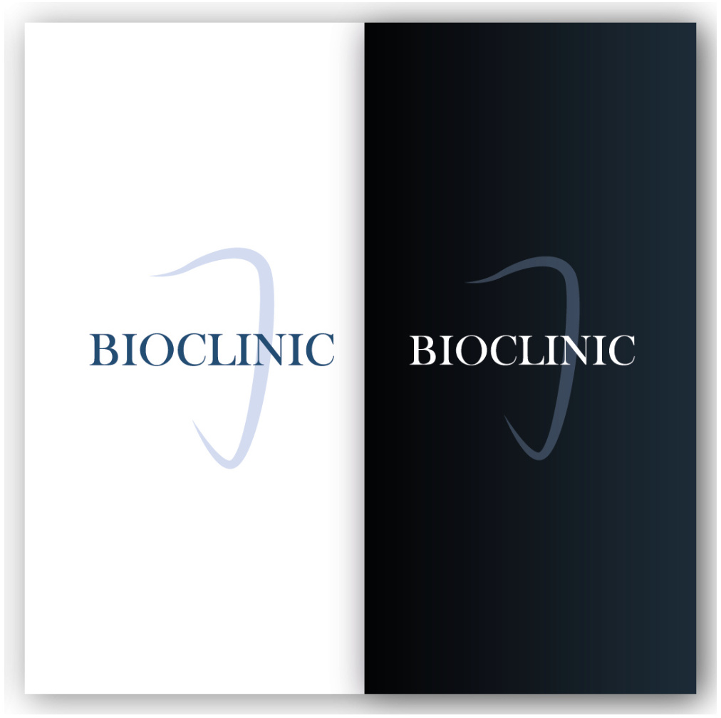
5. Bioclinic is a network of dental centers. We aimed to inspire trust in potential clients, and thus chose a palette of blue and gray hues combined with white, evoking impressions of cleanliness and orderliness.
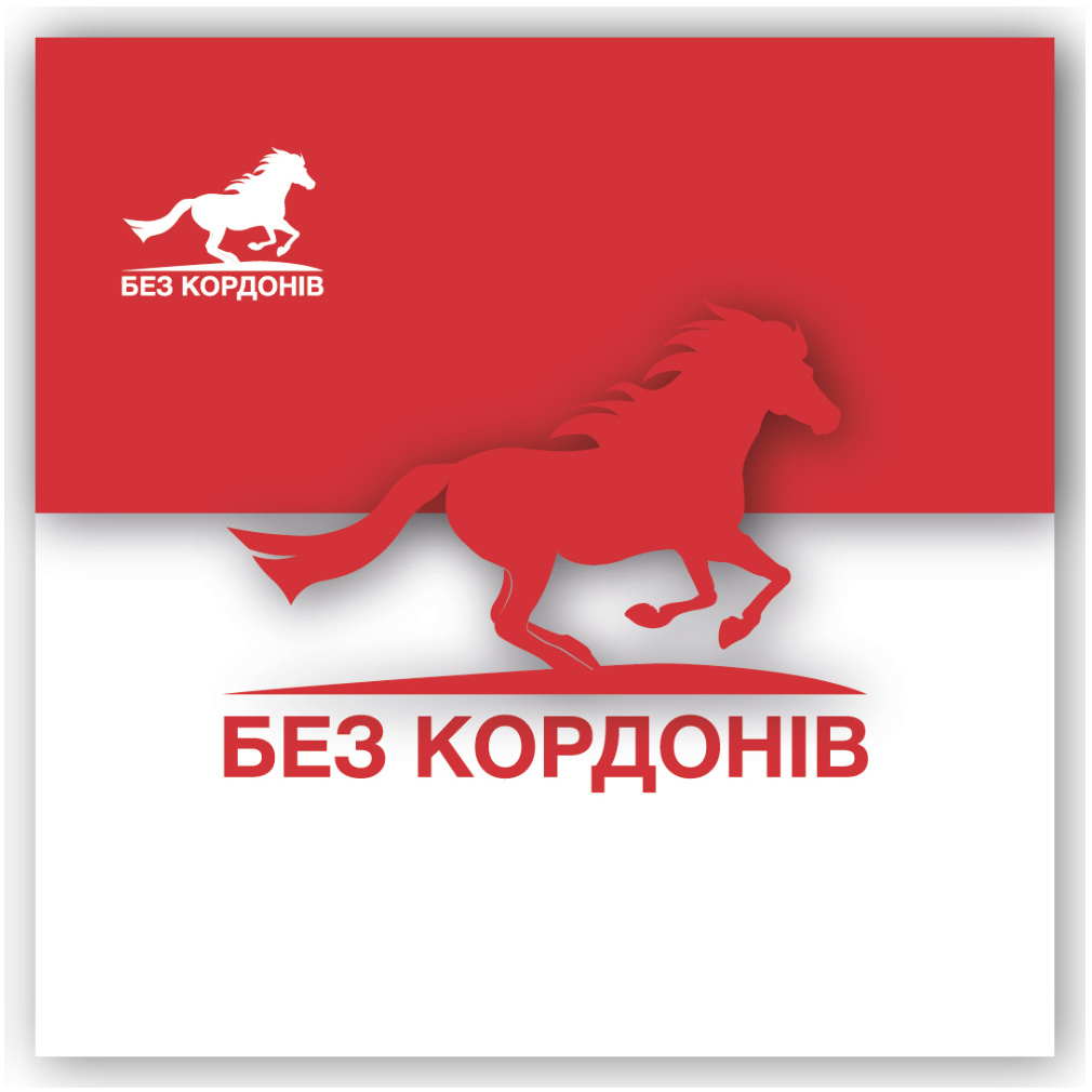
6. Bez Kordoniv is a recruitment agency in the Czech Republic. The horse symbolizes freedom and ease, and its expressive silhouette sets it apart from other company logos. The dominant color is red, a dynamic and vivid signal prompting changes and courageous steps – in this context, the pursuit of a new job.